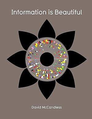
"By visualizing information, we turn it into a landscape that you can explore with your eyes, a sort of information map. And when you’re lost in information, an information map is kind of useful." - David Mccandless
When this book came out in 2010, the idea of data visualisation and 'big data' was still new. People were mostly presenting data in large tables. It's very normal for us to see information in infographic form but (as you can see from the chart below) the word really came into widespread usage in 2003/2004. This book went a long way to showing how large-scale information could be shared in an interesting and engaging way. It's 15 years later and this book still has a lot to teach people.
Synopsis
The book presents complex data in visually stunning infographics. David McCandless takes incredibly intricate and often overwhelming datasets and translates them into beautiful, clear, and easy-to-understand visual representations, making the information digestible at a glance.
It aims to make information more accessible and engaging for everyone. The core idea is that data shouldn’t be confined to specialists or hard-to-read reports. By making it visual, the book invites a broader audience to interact with and comprehend complex topics.
McCandless believes visual design can reveal hidden patterns and connections. When data is laid out graphically, relationships, trends, and anomalies that might be invisible in a spreadsheet suddenly become obvious, offering new insights.
It covers diverse topics, from pop culture to science and global issues. The scope is incredibly broad, demonstrating that the principles of effective data visualization can be applied to nearly any field imaginable, from the frivolous to the profound.
The book challenges traditional ways of presenting facts and figures. Instead of dense text or dry tables, McCandless advocates for an approach that prioritises clarity, aesthetics, and immediate comprehension, pushing against old-fashioned methods.
It demonstrates how data can be beautiful, not just factual. Beyond mere utility, the book celebrates the aesthetic quality of well-designed information, proving that data can be both informative and visually appealing, even inspiring.
Each visual tells a story, making abstract concepts concrete. Rather than just presenting numbers, every infographic is crafted to narrate a particular truth or insight, transforming abstract data points into tangible, relatable narratives.
McCandless showcases the power of data visualization to inform. The book is a powerful argument for the efficacy of visuals in conveying information quickly and effectively, illustrating how a single image can communicate more than pages of text.
The book encourages a more critical and informed view of information. By presenting data so clearly, it implicitly invites readers to question sources, look for biases, and develop a more discerning approach to the information they encounter daily.
It highlights how much information we are bombarded with daily. In our modern world, we’re constantly deluged with data. The book serves as a guide to navigate this deluge, showing how to filter and understand what truly matters.
The overall message is that understanding data can change our worldview. By seeing the world through the lens of well-visualised data, readers gain new perspectives, challenge assumptions, and develop a richer understanding of various phenomena.
It’s a testament to the art and science of clear communication through visuals. “Information is Beautiful” bridges the gap between artistic design and rigorous data analysis, proving that the best communication happens when both are harmoniously combined.

